
A Comprehensive Guide to Mobile-Friendly Testing Tools


In today’s digital-first world, having a mobile-friendly website is not just a luxury—it’s an absolute necessity. With over half of all web traffic coming from mobile devices, users expect fast, responsive, and visually appealing websites. If your site isn’t optimized for mobile users, you’re likely missing out on valuable visitors, potential customers, and even search engine rankings.
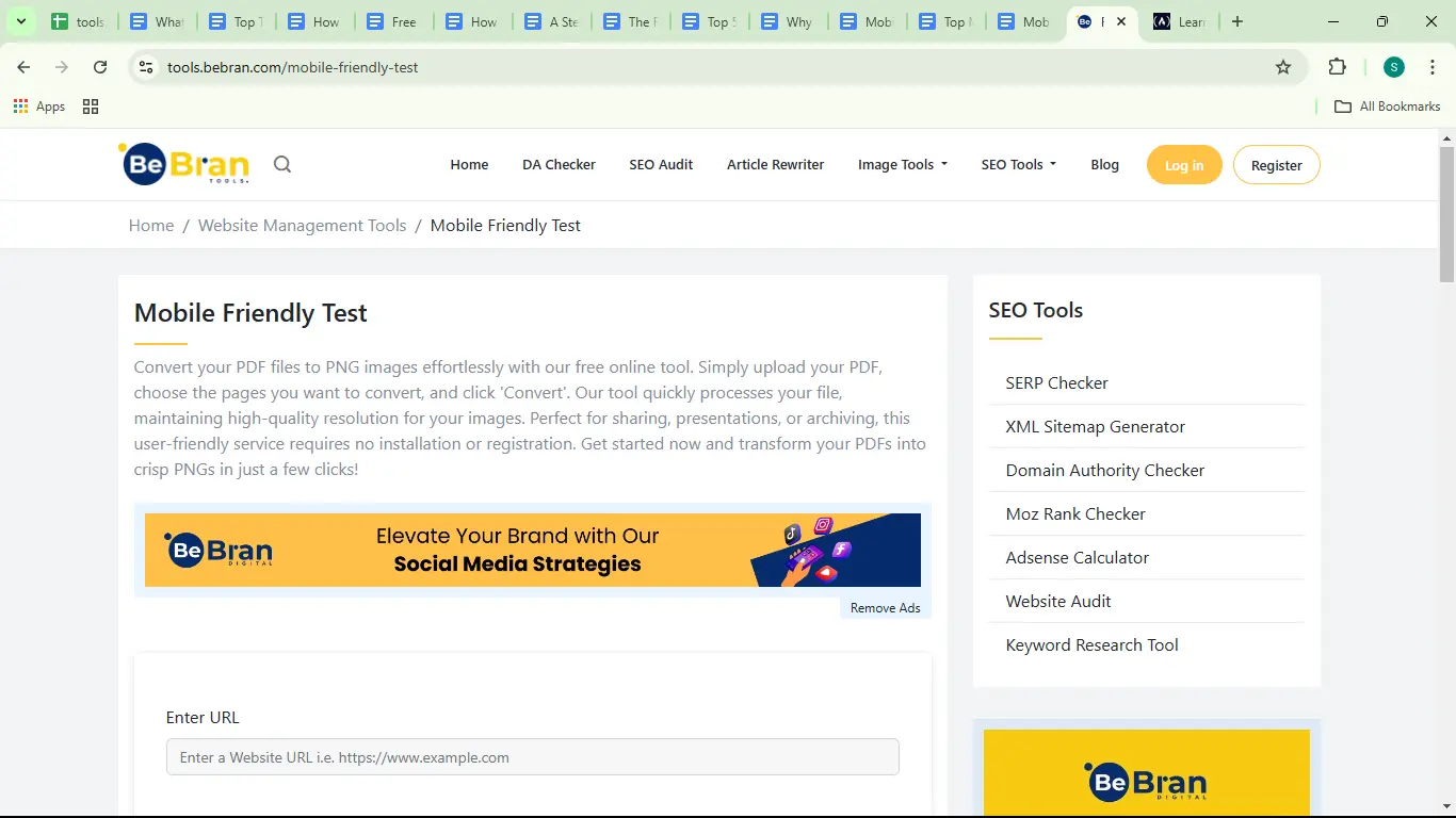
But how do you ensure that your website is optimized for mobile users? The answer lies in mobile-friendly testing tools. These tools help you identify design flaws, usability issues, and performance gaps, enabling you to deliver a smooth mobile experience. Check out BeBran's Mobile Friendly Test.
This comprehensive guide will dive deep into the importance of mobile-friendly testing, the key features to look for in a tool, and the top tools you can use to optimize your site.
Why Mobile-Friendly Testing Is Important
Before we explore the tools, it’s crucial to understand why mobile-friendly testing is so important. Whether you’re a developer, business owner, or marketer, these are the main reasons to test your website’s mobile performance:
1. Improve User Experience
Mobile users have high expectations. They want websites to load quickly, look good, and function smoothly. Mobile-friendly testing ensures your site meets these expectations by identifying and fixing usability issues.
2. Boost SEO Rankings
Google uses mobile-first indexing, which means it prioritizes your site’s mobile version when determining search rankings. A mobile-friendly site is crucial for better SEO performance.
3. Increase Conversions
Whether it’s an online purchase, a newsletter signup, or a form submission, mobile optimization makes it easier for users to take action. A well-optimized site can significantly boost your conversion rates.
4. Stay Competitive
In a crowded online market, having a mobile-friendly site can set you apart from competitors who neglect mobile optimization.
5. Adapt to Evolving Technology
With new devices and screen sizes being introduced regularly, mobile-friendly testing ensures your site remains compatible and responsive.
Key Features of Mobile-Friendly Testing Tools
Mobile-friendly testing tools are designed to evaluate various aspects of your site’s mobile performance. Here are the key features to look for when choosing a tool:
1. Responsiveness Testing
Checks whether your website layout adjusts smoothly to different screen sizes and orientations.
2. Speed Analysis
Evaluates how quickly your website loads on mobile devices and provides suggestions to reduce load times.
3. Readability Checks
Ensures your text is legible without requiring zooming or horizontal scrolling.
4. Navigation Usability
Tests menus, buttons, and forms to ensure they’re easy to use on touchscreens.
5. Real-Device Simulation
Allows you to see how your site performs on actual mobile devices for more accurate results.
6. Core Web Vitals
Measures key performance metrics like loading speed, interactivity, and visual stability, which are critical for both user experience and SEO.
Top Mobile-Friendly Testing Tools
To help you get started, here are the best tools for mobile-friendly testing. Each tool has unique features and benefits, and we’ve highlighted their strengths so you can choose the right one for your needs.
1. BeBran’s Mobile-Friendly Test Tool
At BeBran, we understand how crucial mobile optimization is for your website’s success. That’s why we’ve created a tool that simplifies mobile-friendly testing while providing actionable insights. Check out BeBran's Mobile Friendly Test.
- Features:
- Detailed feedback on layout, readability, and navigation.
- Identifies specific issues like overlapping text, small fonts, and slow loading speeds.
- Offers step-by-step recommendations to improve your site’s performance.
- Why Choose BeBran?
BeBran’s tool is designed for both beginners and experts. It’s free to use, easy to navigate, and provides comprehensive insights Customized to your website’s needs. Whether you’re a developer or a business owner, BeBran’s tool ensures your site delivers a smooth mobile experience.
2. Google’s Mobile-Friendly Test
Google’s tool is one of the most trusted resources for testing mobile usability. It provides a quick pass/fail result and highlights specific issues.
- Features:
- Identifies mobile usability problems such as small text and unclickable elements.
- Shows how Googlebot views your website.
- Provides actionable recommendations to improve mobile friendliness.
- Best For:
Developers and SEO professionals who want to align their sites with Google’s mobile-first indexing requirements.

Free Tools: Free Broken Link Checker Tool Online | Free Password Generator Tool Online | Free Area Converter Tool
3. BrowserStack
BrowserStack is a robust testing platform that allows you to test your site on real devices and browsers, ensuring accurate results.
- Features:
- Access to a wide range of mobile devices and browsers.
- Real-time testing for debugging issues as they occur.
- Automated testing for handling multiple pages efficiently.
- Best For:
Developers managing complex projects who need precise, real-world testing.

4. GTmetrix
GTmetrix focuses on performance optimization, providing valuable insights into your site’s speed and usability.
- Features:
- Measures loading times and Core Web Vitals.
- Provides suggestions for compressing images and optimizing resources.
- Tracks performance over time to monitor improvements.
- Best For:
Website owners prioritizing speed and performance, especially for mobile users.
5. Responsinator
Responsinator offers a simple way to visually check your site’s responsiveness. It’s particularly useful for identifying layout issues.
- Features:
- Displays how your site appears on different devices and screen orientations.
- Highlights design flaws like horizontal scrolling or misaligned elements.
- Best For:
Designers and developers looking for a quick visual check of their site’s layout.
6. MobileTest.me
MobileTest.me lets you simulate your website on popular mobile devices, helping you identify design and usability issues.
- Features:
- Provides live previews of your site on different devices.
- Tests navigation, readability, and responsiveness.
- Best For:
Developers and designers ensuring consistent performance across devices.
How to Perform Mobile-Friendly Testing
To get the most out of mobile-friendly testing tools, follow these steps:
1. Choose a Tool
Select a tool that aligns with your goals. For a comprehensive analysis, start with BeBran's Mobile Friendly Test.
2. Enter Your Website URL
Input your site’s URL to begin the analysis.
3. Review the Report
Examine the tool’s findings, which may include issues like small fonts, slow loading times, or unresponsive layouts.
4. Implement Fixes
Address the identified issues, such as optimizing images, adjusting font sizes, or switching to a responsive theme.
5. Retest Your Site
Run the test again to ensure the issues have been resolved.
Real-Life Example: How BeBran Helped a Business Optimize Their Site
Challenge: A local e-commerce business experienced high bounce rates from mobile users.
Solution:
Using BeBran’s Mobile-Friendly Test Tool, the business identified overlapping elements, slow loading speeds, and small text sizes. They implemented the tool’s recommendations, including compressing images, optimizing layouts, and increasing font sizes.
Results:
- 40% increase in mobile traffic.
- 30% higher conversions.
- Improved user satisfaction based on customer feedback.
Tips for Maintaining a Mobile-Friendly Website
- Test Regularly: Run mobile-friendly tests periodically, especially after making significant updates to your site.
- Optimize Speed: Continuously compress images, minimize scripts, and use caching to improve loading times.
- Focus on Navigation: Ensure menus and buttons remain easy to use on touchscreens.
- Stay Updated: Keep your themes and plugins up to date to avoid compatibility issues.
- Monitor Analytics: Use tools like Google Analytics to track mobile user behavior and identify areas for improvement.
Final Thoughts
Mobile-friendly testing tools are essential for creating websites that look great and perform well on mobile devices. From improving user experience to boosting SEO rankings, these tools help ensure your site is optimized for today’s mobile-first world.
Start with BeBran’s Mobile-Friendly Test Tool for actionable insights and pair it with other tools like Google’s Mobile-Friendly Test or BrowserStack for a well-rounded approach. With regular testing and optimization, you can create a website that not only meets but exceeds the expectations of mobile users.
Explore More: SEO-Friendly Content: Leveraging Rewrite Article Tools for Success | Mastering Content Creation: A Guide to Using Rewrite Article Tools
Frequently Asked Questions
1. What are mobile-friendly testing tools?
Mobile-friendly testing tools evaluate how well a website performs on mobile devices, focusing on usability, design, and responsiveness.
2. Why are mobile-friendly testing tools important?
They help identify issues that affect mobile users, ensuring your website provides a smooth and engaging experience across devices.
3. What features should I look for in a mobile-friendly testing tool?
Key features include responsive design analysis, device simulation, loading speed insights, and actionable recommendations for improvements.
4. Are mobile-friendly testing tools free?
Yes, many tools, like Google’s Mobile-Friendly Test and Chrome DevTools, are free. Paid tools offer advanced features like in-depth reports and multi-device simulations.
5. Can these tools test how a site performs on different screen sizes?
Yes, most tools allow you to simulate various devices and screen resolutions, ensuring your site adapts well to all users.
6. How do mobile-friendly tools help with responsive design?
They evaluate how elements like images, text, and menus resize or reposition to fit smaller screens without losing functionality or aesthetics.
7. Are mobile-friendly testing tools suitable for beginners?
Yes, most tools are user-friendly and provide clear reports, making them accessible even for those with no technical background.
8. How often should I use mobile-friendly testing tools?
Run tests regularly, especially after updates or changes to your site, to ensure it remains optimized for mobile users.
9. Can mobile-friendly testing tools improve SEO?
Absolutely. Mobile optimization is a ranking factor for search engines like Google, so testing tools help you identify and fix issues that could affect your SEO.
10. What are some popular mobile-friendly testing tools?
Popular options include Google’s Mobile-Friendly Test, Chrome DevTools, BrowserStack, and GTmetrix, each offering unique features for mobile optimization.