
A Step-by-Step Guide to Mobile-Friendly Testing


Mobile-friendliness has become essential for any website with the rise of smartphones and tablets. If your site isn’t optimized for mobile users, you’re likely losing a significant portion of your audience. Not only that, but search engines like Google also prioritize mobile-friendly websites in their rankings. The good news? Testing your website for mobile-friendliness is easier than you think. Check out BeBran's Mobile Friendly Test.
In this blog, we’ll walk you through a step-by-step guide to mobile-friendly testing and provide actionable tips to improve your website’s performance on mobile devices.

Why Mobile-Friendly Testing Matters
Before we dive into the steps, let’s understand why this process is so crucial:
- User Experience: Mobile users expect a Smooth browsing experience with easy navigation and readable content.
- SEO Rankings: Google uses mobile-first indexing, meaning your site’s mobile version is its primary version for ranking purposes.
- Increased Conversions: A mobile-optimized site improves the likelihood of users taking desired actions, such as making a purchase or filling out a form.
- Broader Audience Reach: With over 60% of web traffic coming from mobile devices, mobile optimization ensures you’re not missing out on potential visitors.
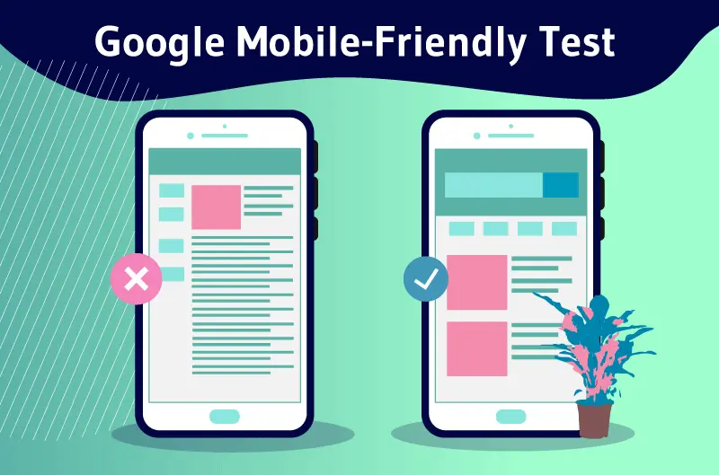
What Is Mobile-Friendly Testing?
Mobile-friendly testing is the process of analyzing your website to ensure it performs well on mobile devices. This involves checking elements like:
- Responsive Design: Does your site adjust to different screen sizes?
- Loading Speed: Does your site load quickly on mobile networks?
- Ease of Navigation: Are buttons, links, and menus easy to use?
- Content Display: Is text readable without zooming, and are images properly scaled?
These tests provide insights into potential issues and offer suggestions for improvement.
Step-by-Step Guide to Mobile-Friendly Testing
Step 1: Choose a Mobile-Friendly Testing Tool
Start by selecting a reliable tool to analyze your website’s mobile performance. Some excellent options include:
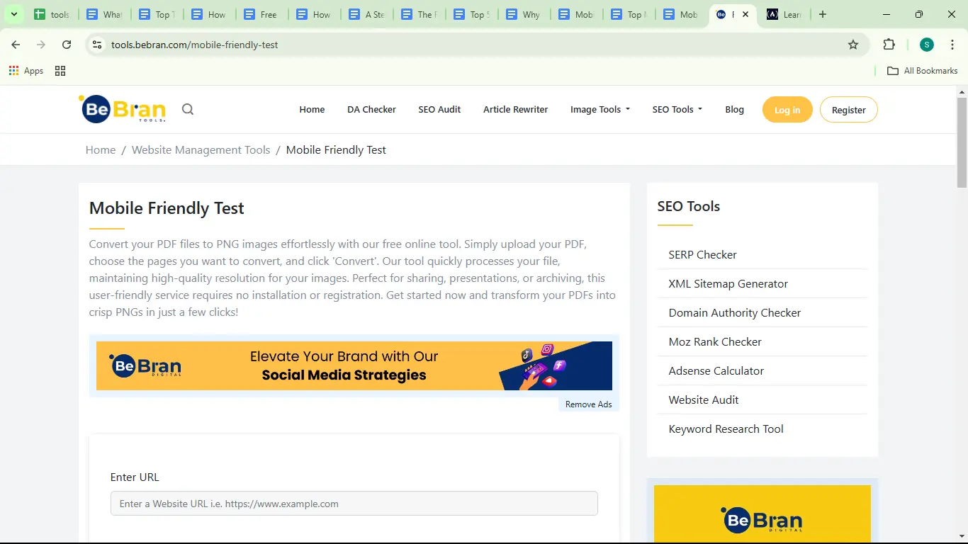
- BeBran's Mobile Friendly Test.: A user-friendly tool designed to help business owners and developers improve their mobile site.
- Google’s Mobile-Friendly Test.
- BrowserStack.
- GTmetrix.
These tools analyze various aspects of your site and generate detailed reports.
Step 2: Input Your Website URL
Once you’ve chosen a tool, enter your website’s URL into the testing tool’s search bar and start the analysis. Most tools process your site within seconds and deliver a report on its mobile performance.
Step 3: Analyze the Results
The test results will highlight key metrics, such as:
- Mobile Usability: Checks for issues like overlapping text or clickable elements that are too close together.
- Loading Speed: Identifies elements slowing down your site.
- Responsive Design: Ensures the layout adjusts correctly to various screen sizes.
Pay attention to any specific issues flagged by the tool, such as small font sizes or unoptimized images.
Step 4: Identify Critical Pages for Testing
Your homepage isn’t the only page that matters. Focus on testing critical pages, such as:
- Product or service pages.
- Contact or inquiry forms.
- Checkout pages (if you’re running an e-commerce site).
- Blog posts or resource pages.
These are the pages most likely to impact user engagement and conversions.
Step 5: Conduct Real-Device Testing
While testing tools provide valuable insights, they can’t fully replicate the experience of using a real mobile device. Use tools like BrowserStack or MobileTest.me to see how your site looks and functions on actual devices.
Step 6: Address Identified Issues
Use the feedback from the mobile-friendly test to make improvements to your site. Common fixes include:
- Implementing a Responsive Design: Ensure your layout adjusts Smoothly to all screen sizes using frameworks like Bootstrap or CSS Grid.
- Optimizing Images: Compress large images to reduce loading times.
- Improving Navigation: Increase button sizes and add proper spacing between clickable elements.
- Enhancing Readability: Use a legible font size (16px or larger) and ensure adequate contrast between text and background.
Step 7: Retest Your Website
After making adjustments, run the mobile-friendly test again to ensure all issues have been resolved. Regular testing helps maintain your site’s performance as you update content or add new features.
Free Tools: Free Paraphrased Tool Online | Free Word Counter Tool Online | Free Keyword Density Checker Tool Online
Tools for Mobile-Friendly Testing
Here’s a closer look at the tools you can use:
1. BeBran’s Mobile-Friendly Test Tool
Check out BeBran's Mobile Friendly Test, a simple yet powerful tool to evaluate your website’s mobile performance.
- Features:
- In-depth analysis of responsiveness and usability.
- Actionable insights to improve site design and functionality.
- Free to use, making it accessible to businesses of all sizes.
2. Google’s Mobile-Friendly Test
This tool offers a pass/fail result along with specific recommendations for fixing mobile usability issues.
- Best For: SEO professionals looking to align their site with Google’s mobile-first indexing standards.
3. GTmetrix
GTmetrix focuses on performance metrics like loading speed, which are crucial for mobile users.
- Best For: Identifying and fixing speed-related issues.
4. BrowserStack
BrowserStack allows you to test your site on real devices, providing an accurate representation of user experience.

- Best For: Developers seeking precise testing across various devices and browsers.
5. Responsinator
Responsinator gives a visual preview of how your site appears on different mobile devices and screen orientations.
- Best For: Quick design checks for responsiveness.
Common Mobile Usability Issues and Solutions
1. Slow Loading Speed
- Issue: Mobile users often abandon sites that take longer than 3 seconds to load.
- Solution: Compress images, enable browser caching, and minimize JavaScript files.
2. Small Fonts and Buttons
- Issue: Text that’s too small or buttons that are too close together make navigation difficult.
- Solution: Use larger font sizes and increase spacing between clickable elements.
3. Unresponsive Design
- Issue: Layouts that don’t adjust to screen sizes create a poor experience.
- Solution: Use responsive design frameworks to ensure Smooth adaptation.
4. Intrusive Pop-Ups
- Issue: Pop-ups that cover content frustrate users.
- Solution: Use mobile-friendly pop-ups or avoid them entirely.
Benefits of Regular Mobile-Friendly Testing
1. Improved User Experience
A mobile-friendly site ensures users can navigate and interact with your site easily, increasing engagement and satisfaction.
2. Higher SEO Rankings
Mobile-friendly websites rank higher in search engines, driving more organic traffic.
3. Increased Conversions
Optimized navigation and usability lead to more completed actions, whether it’s making a purchase or signing up for a newsletter.
4. Competitive Advantage
With more businesses optimizing for mobile, staying ahead ensures you remain competitive in your industry.
Real-Life Example: BeBran’s Mobile-Friendly Test in Action
Challenge: A small retail business noticed a decline in mobile traffic and sales.
Solution: They used BeBran's Mobile Friendly Test to identify issues like slow loading times and unresponsive layouts. After implementing the recommended changes, including image optimization and adopting a responsive design, they saw significant improvements.
Results:
- 30% Increase in Mobile Traffic: Improved usability attracted more visitors.
- 20% Higher Conversions: Customers found it easier to navigate and make purchases.
- Better SEO Rankings: Their site ranked higher for mobile-related searches.
Tips for Maintaining Mobile-Friendliness
- Test Regularly: Run mobile-friendly tests periodically, especially after major updates.
- Optimize Media: Use compressed images and videos for faster loading.
- Focus on Speed: Use tools like GTmetrix to monitor and improve loading times.
- Keep It Simple: Avoid cluttered designs and prioritize usability.
- Stay Updated: Keep up with mobile optimization trends and Google’s guidelines.
Final Thoughts
Ensuring your website is mobile-friendly is no longer optional—it’s essential for providing a great user experience and staying competitive in today’s digital world. By following this step-by-step guide and using tools like BeBran’s Mobile-Friendly Test Tool, you can identify and fix issues that may be holding your site back.
Start testing your website today, and take the first step toward creating a Smooth mobile experience for your audience!
Explore More: Measuring Domain Authority with Domain Age Checker Tools | Monitoring Your Competitors' Domain Authority: A Competitive Edge
Frequently Asked Questions
1. What is mobile-friendly testing?
Mobile-friendly testing evaluates how well your website performs on mobile devices, ensuring it provides a smooth experience for users.
2. Why is mobile-friendly testing important?
It helps identify design and usability issues that may affect mobile users, ensuring your site meets modern standards and improves user engagement.
3. How do I start a mobile-friendly test?
Choose a testing tool, like Google’s Mobile-Friendly Test, enter your website URL, and analyze the results provided.
4. What areas should I focus on during testing?
Focus on responsive design, text readability, navigation ease, loading speed, and proper scaling of images and elements on smaller screens.
5. Can I test individual pages or just the whole website?
You can test individual pages, which is especially helpful for ensuring consistency across your site’s different sections.
6. What are common mobile-friendly issues detected during testing?
Issues include text that’s too small, clickable elements that are too close, unoptimized images, and content that doesn’t fit within the screen.
7. How do I fix mobile-friendly issues found during testing?
Use responsive design, optimize images, adjust font sizes, and ensure spacing between clickable elements to make your site user-friendly on mobile devices.
8. Are there tools to simulate different devices during testing?
Yes, tools like BrowserStack and Google’s DevTools allow you to simulate how your site appears on various devices and screen sizes.
9. How often should I perform mobile-friendly testing?
Run tests regularly, especially after design updates or content changes, to ensure your site remains optimized for mobile users.
10. Does mobile-friendly testing improve my SEO?
Yes, mobile-friendly websites rank better in search engines because they align with mobile-first indexing and improve user experience.