Creating Responsive Designs with the Help of HTML Online Viewers


In the world of web design, a responsive design ensures that your website looks and works well on all types of devices, from large desktop screens to small smartphones. HTML online viewers are fantastic tools for developing responsive designs, allowing you to test and tweak your code quickly. In this guide, we’ll explore how you can use an HTML online viewer, like BeBran’s Free HTML Viewer, to create responsive designs easily and effectively.
Why Responsive Design Matters
Before diving into techniques, it’s important to understand why responsive design is essential:
- Improved User Experience: A responsive website provides a Smooth experience, making it easy for users to navigate on any device.
- Better SEO: Search engines like Google favor mobile-friendly websites, which can help improve your site’s search ranking.
- Increased Reach: A responsive design ensures your content is accessible to a larger audience, no matter what device they’re using.
- Professional Appearance: A site that looks good on all devices builds trust and gives a strong, professional impression.
With these benefits in mind, let’s explore how to use an HTML online viewer to create a responsive website.
1. Testing Responsiveness with Real-Time Previews
One of the key features of HTML online viewers is their ability to show real-time previews. BeBran’s Free HTML Viewer, for instance, lets you see how your code changes look instantly.
- Resize the Browser Window: In Our viewer, you can adjust your browser window to simulate different screen sizes, such as desktop, tablet, and mobile. This gives you a quick overview of how the page responds on different devices.
- Quickly Spot Issues: Real-time testing helps you immediately see if something doesn’t look right, allowing you to make adjustments without leaving the tool.
Real-time previews make testing and refining your design faster, saving time and helping you achieve a polished, responsive layout.
Free Tools: Free Domain Age Checker Tool Online | Free Bulk Email Validator Tool Online | Free Online Ping Website Tool Online
2. Designing with Fluid Layouts
Responsive websites often use fluid layouts, which adapt to the screen’s width. Instead of fixed sizes, fluid layouts use flexible elements that resize automatically.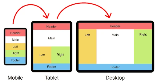
- Use Percentages for Widths: Instead of setting a width in pixels, try using percentages. For example, setting an image width to 50% of the screen makes it adjust as the screen size changes.
- Test in the Viewer: Our viewer allows you to experiment with fluid layouts and see how percentages impact design. You can instantly check if your elements resize smoothly without breaking the layout.
Fluid layouts ensure your design remains consistent across different devices and screen sizes.
3. Adjusting Fonts and Images for All Screen Sizes
In responsive design, text and images should look good on any screen size. Here’s how to make sure they work well on mobile, tablet, and desktop views:
- Flexible Font Sizes: Use relative units like "em" or "rem" instead of fixed sizes. This ensures your text adjusts based on screen size, remaining readable on smaller screens.
- Images that Resize: Set images to a percentage of the screen width so they scale down automatically on smaller devices. This prevents images from appearing too large on mobile.
With Our Online HTML Viewer, you can test different font sizes and image behaviors to see how they look in real time, ensuring your content remains clear and visually appealing.
4. Using Media Queries for Advanced Customization
Media queries are CSS rules that apply specific styles based on screen size. They’re powerful tools for creating responsive designs, allowing you to adjust layouts for various devices.
- Set Breakpoints for Different Devices: A common practice is to set breakpoints at 768px for tablets and 480px for mobile phones. This way, you can apply different styles to elements depending on the screen size.
- Experiment in BeBran’s Viewer: Use the viewer to test these breakpoints. Adjust the layout and font sizes as the screen size changes, and see how the media queries apply instantly.
Media queries provide greater control, making it easier to Customize your design for each device type, from large desktops to small smartphones.
5. Creating a Mobile-First Design
Mobile-first design means designing your website for the smallest screens first, then building up to larger screens. This approach ensures your design is optimized for mobile users, which is especially important as mobile traffic grows.
- Start with Simple Layouts: Begin by creating a clean, straightforward design that works on mobile screens. Think about essential elements and prioritize content that users need most.
- Expand for Larger Screens: Once the mobile layout is set, add additional styles for larger screens using media queries. This helps create a natural flow from mobile to desktop.
By working with BeBran’s viewer, you can build a mobile-friendly layout first, then test it as you add more features for larger screens. This approach often results in a cleaner, faster-loading design.
6. Testing Responsiveness on Common Elements
Certain elements are especially important in responsive design. Here’s what to pay attention to when testing:
- Navigation Menus: Make sure menus are easy to use on mobile. Hamburger menus (three-line icons) are popular for smaller screens as they keep the menu hidden until clicked.
- Buttons and Forms: Ensure that buttons are large enough to tap on mobile screens, and that forms are easy to fill out.
- Spacing and Padding: Mobile screens are smaller, so spacing and padding may need to be adjusted to avoid crowded or overlapping elements.
Our Free HTML Viewer allows you to test these elements in real time, helping you create a user-friendly experience across all devices.
7. Building a Consistent Brand Across Devices
Responsive design helps maintain a consistent look and feel for your brand, ensuring that visitors recognize and trust your site no matter what device they use.
- Consistent Colors and Fonts: Keep your branding elements consistent by choosing colors and fonts that adapt well to different screen sizes.
- Align with Brand Identity: Use Our viewer to test and refine these design details, ensuring your brand’s identity shines through consistently across all device types.
This approach reinforces brand recognition, creating a Smooth experience from desktop to mobile.
8. Optimizing for Faster Loading Times
Loading times are crucial for both SEO and user experience. Responsive design often means optimizing images, reducing code, and ensuring the website loads quickly on all devices.
- Use Compressed Images: Smaller file sizes mean faster loading times. Make sure images are optimized for mobile to speed up performance.
- Simplify Code: Avoid unnecessary elements or features that slow down the site. Use only essential elements in your responsive design.
Using Our HTML Viewer, you can test how well your layout performs by quickly making changes and seeing the effects on your design in real time.
Final Thoughts
Creating a responsive design is essential in today’s multi-device world. By using tools like BeBran’s Free HTML Viewer, you can easily test, adjust, and perfect your website’s design across various screen sizes. Whether you’re a beginner or an experienced developer, responsive design principles like fluid layouts, media queries, mobile-first design, and optimized elements are all manageable with an HTML online viewer. This approach ensures that your website looks great, functions well, and is accessible to everyone—no matter the device they use.
Explore More: How to Use an HTML Online Viewer to Debug Your Code | Speed Up Your Website with HTML Minification: Best Practices | Best Paraphrasing Tools for Writers in 2025
Frequently Asked Questions
- What is a responsive design in web development?
Responsive design ensures that web pages adjust Smoothly across various devices and screen sizes, providing an optimal user experience. - What best defines responsive design?
Responsive web design is a modern take on web design that allows web pages to accurately display and render the same experience across all screen sizes and devices. From desktops and laptops to smartphones and smart TVs, responsive website design allows your website to naturally adapt to any screen. - What is the responsive design process?
Responsive design is the process of designing user interfaces to accommodate multiple viewports. The aim is to provide a consistent user experience no matter what device someone uses. - What is a responsive web design framework?
A responsive website design framework provides a toolkit that helps to build a website that works on all screen sizes and devices, ensuring an adaptive layout. - Are there HTML online viewers that integrate with frameworks like Bootstrap?
Yes, certain HTML online viewers support integration with frameworks such as Bootstrap, aiding in the development of responsive layouts. - How do our HTML online viewers handle responsive images?
Developers can use our HTML online viewers to implement and test responsive image techniques, ensuring images scale appropriately across devices. - Can I use HTML online viewers to test touch interactions for mobile devices?
While basic touch interactions can be tested, comprehensive testing may require additional tools or physical devices. - Do HTML online viewers provide debugging tools for responsive design issues?
Many HTML online viewers include built-in debugging tools, assisting developers in identifying and resolving responsiveness-related problems. - Are there limitations to using HTML online viewers for responsive design testing?
While useful for initial testing, HTML online viewers may not fully replicate all device-specific behaviors, necessitating further testing on actual devices. - What are some recommended HTML online viewers for responsive design development?
Popular options include BeBran, CodePen, JSFiddle, and W3Schools' online editor, each offering features conducive to responsive design development.